UserAccounts
|
Size: 15046
Comment: completes “Name & Passcode”
|
Size: 16448
Comment: + structure diagrams and other tweaks
|
| Deletions are marked like this. | Additions are marked like this. |
| Line 4: | Line 4: |
<<Anchor(logged-in)>> == Standard logged-in symbol == {{attachment:logged-in.png}} The same symbol should be used to represent an account that is currently logged in, everywhere it appears — including System Settings, the login screen, and [[SystemMenu|the system menu]]. |
|
| Line 14: | Line 21: |
| Whenever the window width is less than 90 GU (“narrow”), “My account” and each of the “Other accounts” should be page stack items. Whenever the window is at least 90 GU (“wide”), to reduce modality, the accounts should instead be in a listbox alongside the settings for the selected account. ||<^ style="border:none">{{attachment:user-accounts.narrow.png}}||<^ style="border:none">{{attachment:name-and-passcode.wide.png}}|| |
||<^ style="border:none">{{attachment:user-accounts-structure.narrow.png}}||<^ style="border:none">{{attachment:user-accounts-structure.wide.png}}|| Whenever the window width is less than 90 GU (“'''narrow'''”), the list of accounts should consist of page stack items, each navigating to a screen with the settings for that account. Whenever the window is at least 90 GU (“'''wide'''”), to reduce modality, the accounts should instead be in a listbox alongside the settings for the selected account. |
| Line 27: | Line 34: |
| ''TBD'' | ||<^ style="border:none">{{attachment:user-accounts-list.narrow.png}}||<^ style="border:none">{{attachment:user-accounts-list.wide.png}}|| The user account list should consist of two labelled sections, “My account” and “Other accounts”. The item for each account should consist of its icon, display name, caption (“Allowed” or “Not allowed” for Guest, “Standard” or “Administrator” for any other), and [[#logged-in|logged-in symbol]] if appropriate. When the window is wide, the list as a whole should be followed by buttons for [[#account-add|adding]] and [[#account-add|removing]] an account, and (eventually) for managing user groups. (When the window is narrow, adding an account is done from the header, while removing an account is done from within the account’s screen.) |
| Line 32: | Line 45: |
| ||<^ style="border:none">{{attachment:account-structure.narrow.png}}||<^ style="border:none">{{attachment:account-structure.wide.png}}|| |
|
| Line 37: | Line 52: |
''Erratum: The “Show my login name in the menu bar” checkbox should be present (see SystemMenu).'' |
This is an incomplete design for how user accounts should be presented in Ubuntu.
Contents
Standard logged-in symbol

The same symbol should be used to represent an account that is currently logged in, everywhere it appears — including System Settings, the login screen, and the system menu.
Settings

System Settings “System” section should include a “User Accounts” item. When these settings are implemented, the previous “Accounts” panel should be distinguished by being renamed to “Internet Accounts” with an obviously distinct icon (bug 1289401).
UI structure
|
|
Whenever the window width is less than 90 GU (“narrow”), the list of accounts should consist of page stack items, each navigating to a screen with the settings for that account. Whenever the window is at least 90 GU (“wide”), to reduce modality, the accounts should instead be in a listbox alongside the settings for the selected account.
If the screen changes from wide to narrow, which screen becomes shown should depend on what is focused:
- If any of the controls for configuring an individual account is focused, the screen containing the equivalent control should be shown.
- Otherwise, the top-level “User accounts” screen should be shown.
Conversely, if the screen changes from narrow to wide, the appropriate tab should be shown such that the focused control remains visible.
Account and group list
|
|
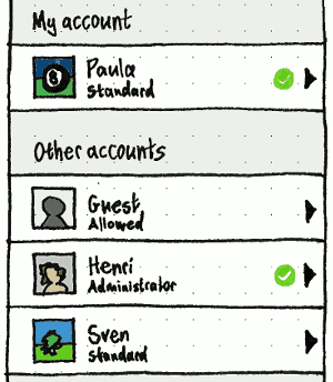
The user account list should consist of two labelled sections, “My account” and “Other accounts”.
The item for each account should consist of its icon, display name, caption (“Allowed” or “Not allowed” for Guest, “Standard” or “Administrator” for any other), and logged-in symbol if appropriate.
When the window is wide, the list as a whole should be followed by buttons for adding and removing an account, and (eventually) for managing user groups. (When the window is narrow, adding an account is done from the header, while removing an account is done from within the account’s screen.)
Configuring an individual account
|
|
|
|
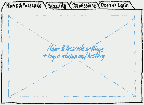
On a wide screen, the controls for the selected account should be split across four tabs: “Name & Passcode”, “Security”, “Permissions”, and (when implemented) “Open at Login”.
On a narrow screen, to reduce navigation, the elements on the “Name & Passcode” tabs should be on an account’s top-level screen instead (since they are the settings you’re most likely to want to change). The other tabs, and “History”, should be page stack items instead.
Erratum: The “Show my login name in the menu bar” checkbox should be present (see SystemMenu).
“Name & Passcode”
Login name
Changing the login name is a bonus feature that may not be implemented initially.
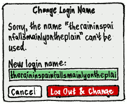
Whether a login name (username) is valid is subject to complex PAM configuration, and therefore not easy to validate in a GUI. And changing a username is best done while that account is logged out. For those two reasons, changing the login name should be done not with an instant-apply field, but with a “Change Login Name” dialog where committing tests the new name and logs out the user if necessary.
If you are renaming the account of:
- someone who is not logged in, the main action button should be “Change”;
yourself, the main action button should be “Log Out & Change”, and there should be body text “You need to log out to change the login name.”
anyone else who is logged in, the main action button should be “Log Out & Change”, and there should be body text “This account is logged in. Changing the login name will log them out immediately and may cause data loss.”.
Regardless of PAM configuration, the “New login name:” field should validate basic requirements:
Whenever it is empty, “Change”/“Log Out & Change” should be disabled.
Whenever the contents matches the login name of any existing user, “Change”/“Log Out & Change” should be disabled, and the error caption “That name is already in use.” should appear below the field.
- If you try to enter more than 31 characters by any method, there should be an alert signal, and surplus characters should be ignored.
Because the UI can’t validate a login name itself, choosing “Change”/“Log Out & Change” should leave the dialog open, in the standard progress state, while testing whether the name can be used by creating then instantly deleting a new account with that name.
If that fails, the dialog should stay open and the body text should change to: ‘Sorry, the name “{failed name}” can’t be used.” The failed name should become selected so that typing will replace it, and the main action button should be disabled until the field contents changes.
If the test succeeds, the dialog should remain open in the standard progress state while the logout (if necessary) and rename takes place. If you’re changing your own login name:
- If any app cancels logout, the dialog should return to its previous state so that you can either cancel or try again.
- If no app cancels logout, the dialog should be the last thing you see before logout. When you next log in, System Settings should reopen to the same screen.
If the rename itself fails, an error alert should appear: “Sorry, the account could not be renamed.”
Passcode
The passcode should be followed by “Change…”, which invokes the same UI for changing it as in “Security & Privacy”. The only difference should be that for someone else’s account, the “Current passcode:” field is not present.
Login history
The “Last login:” timestamp should be in the user’s preferred format, followed by a relative time to zero decimal places in the most appropriate unit, for example “(47 seconds ago)”, “(1 minute ago)”, or “(4 months ago)”.
This should be followed by:
- “Currently logged in” (with the standard logged-in emblem) if the account is currently logged in (for example, if it is your own); or otherwise
- “Last logout:” and a timestamp in the same format as “Last login:”.
“Security”
The various options for identification and authentication may be implemented in any order.

If your own account is selected, the heading for the first column in the “Security” tab should be “To identify me, I can use any of:”, and for the second column “To authenticate me, require all of:”. Otherwise, the headings should be “This account can identify with any of:” and “Authenticating requires all of:” respectively.
Each option for identification and authentication should appear only when hardware is present that can use it.
Options may be insensitive, in checked or unchecked state, as defined by an administrator. In addition, whenever an identification option is checked, the equivalent authentication option should be unchecked and insensitive, and vice versa, because you can’t use the same option for both.
If an option is currently unregistered (for example, if you have not registered your fingerprints), checking either checkbox for that option should act as if you also clicked the relevant “Register” button.
Fingerprints
For comparison: Fingerprint GUI, Fingerprint authentication in Fedora, Microsoft Fingerprint Reader, Lenovo ThinkVantage, Authentec TrueSuite
Choosing “Register Fingerprints…” should open a “Register Fingerprints” dialog.
If the reader reports a percentage complete, the gauge should reflect that percentage. Otherwise, if the reader reports an exact numbers of swipes required for registration, the gauge should move to the appropriate fraction with each swipe. Otherwise, it should move asymptotically — to 1/2 with the first swipe, 2/3 with the second, 3/4 with the third, etc — until registration is complete.
Smart card
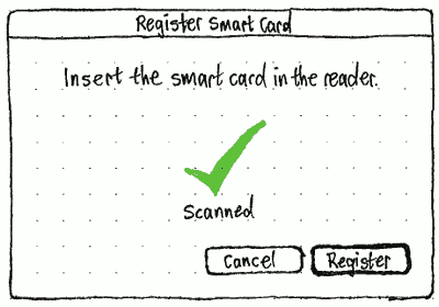
Choosing “Register Smart Card…” should open a “Register Smart Card” dialog.


Before the smart card has been read successfully, “Register” should be insensitive, and the “Scanning…” graphic should animate slowly just like its equivalent in the PolicyKit prompt. After the smart card has been read, the graphic should change to the “Scanned” checkmark, and “Register” should become sensitive.
“Permissions”
In the “Permissions” tab, the “Account type:” menu should contain items for “Standard” and “Administrator”. Whenever the selected account’s access privileges do not match either of those two types, the menu should also contain a selected “Custom” item until you exit the tab/screen.
The “This account:” list should contain checkbox items for all the configurable privileges.
Whenever “Has mandatory Launcher items” is checked, the “Choose…” button at its trailing end should be sensitive. Choosing it should open a dialog containing a desktop, including a non-auto-hide Launcher containing only the current mandatory items.

“Launching” an application inside this dialog should not actually launch it, but should add it to the Launcher as a mandatory item. Each configurable Launcher item should have a Delete button overlaid in its top right corner as a badge, with accessible label “Remove From Mandatory Items”. Choosing “Revert” should return the Launcher to the state when the dialog was opened, without closing the dialog. “Change” should be sensitive only when the current state is different from when the dialog was opened.
Back in the “This account:” list, whenever “Has mandatory Launcher items” is unchecked, the indented “Can add other Launcher items” item should be both insensitive and checked.
See also SecurityPermissions.
“Open at Login”
Originally proposed on the Gnome wiki in 2012.
|
The final tab for any user account, including the guest account, should be “Open at Login”. (Other names that were considered: “Login Items”, “Start at Login”, and “Launch at Login”. “Open” best covers both apps and documents.)
The tab should begin with an explanatory sentence: “Apps, bookmarks, and other files can be opened automatically each time this account logs in.”.
This should be followed by a listbox with two columns, “Open” and “Name”. The list should be empty for a new user account, and if it is not empty no item should be selected by default. If an item is in the list, and its “Open” checkbox is checked, it should open at every future login until either of those things changes.
Below the listbox should be three buttons: an Add menubutton (keyboard equivalent “+”), a Remove button (“-”), and a Change button (Enter).
Choosing “Add Application…” from the Add menu should open an “Add Application” application picker. (This should be the same dialog as used for any file manager’s “Open With Other Application…” command.)
Choosing “Add File…” should open an “Add File” file picker, defaulting to the previous folder if it exists, or the home folder if not.
Choosing “Add Custom Command…” should open an “Add Custom Command” dialog. The “Command:” field in the dialog should auto-complete pathnames. The file button should open a file picker that replaces the current field contents. “Add” should be disabled whenever the field is empty.

The Remove and Change buttons should be enabled whenever an item is selected. Activating the Remove button should remove that item. Choosing Change button should open the relevant dialog for the type of item — a “Change Application” application picker, a “Change File” file picker, or a “Change Custom Command” dialog — with the current value pre-selected or pre-filled.
Dragging an application, bookmark, or file from any other app into the listbox should add it to the list. Dragging any item out of the list should remove it.
Future enhancement: For apps, have an extra checkbox for whether they should open minimized. [idea from “tommy”]
Future enhancement: When adding an item as an administrator to someone else’s account, have a checkbox for whether that person can remove it. [idea from “tommy”]
Future enhancement: Automatically stagger launches to avoid disk contention. [idea from Evan Huus]
Configuring the guest account
The UI for configuring a guest account should be the same as for any other account, with the following exceptions.
TBD
Adding an account
Removing an account
…
The remove account function should be enabled if you are authenticated as an administrator, and the Guest account is not selected.
If you select the only remaining administrator account, the remove account function should not be disabled, because the reason would not be obvious. Instead, if you choose it, a confirmation alert should appear: ‘“{login name}” is the only administrator account. You must create a new administrator account before removing this one.” It should have “Cancel” and “Create Admin Account…” buttons, where “Create Admin Account…” switches to the “Add Account” UI with “Account type:” preset to “Administrator”.
Otherwise, if you choose to remove your own account, a confirmation alert should appear: “Deleting your own account will log you out immediately.” It should have “Cancel” and “Delete Anyway” buttons, where “Cancel” is the default.
Logging in
See also “User Selector and Welcome Screen (tbc)”
Locking the session
Logging out
Switching accounts
Seeing who else is logged in
Restarting or shutting down when others are logged in
UserAccounts (last edited 2016-07-26 15:08:32 by mpt)


